
How to create impressive Excel dashboards
- Oct 17, 2016
- 12 min read
Updated: Jan 26, 2024
GET A FREE TEMPLATE OF EXCEL DASHBOARD AT THE END OF THIS POST!
Dashboards are reporting tools meant to help managers make business decisions. They provide an overview of a situation or activity to understand the key results, trends and attention points.
This post will provide you with valuable design principles and many tips and tricks to make impressive dashboards that update in less a minute.
TABLE OF CONTENT
Introduction
What does a good Excel dashboard look like?
👉 It's beautiful! Most managers will take just 1 look at your dashboard and decide in 10 seconds or less if they want to check it. You need to make it appealing for them to want to explore it, and they need to be able to understand the data almost instantly.
👉It's dynamic! We all look at things from a different angle. A dynamic dashboard should allow managers to easily play with the data and deep dive into it to analyze a specific KPI by country, product, segment etc.
👉It takes 1min to update! Don't spend hours or days updating your dashboard. Make your dashboards super easy to update. This way:
The dashboard will contain fresh data and stay relevant
Your colleagues can update the dashboard for you when you're on holiday
You can save time and leave the office early

Before you start: define your KPIs and data sources
Quite obviously, the first thing you need to know before creating a dashboard is to know why.
You have to ask yourself the key questions: what do you want to show? who will be the recipients? what are your KPIs? where will the data come from?
Discuss the expectations with every stakeholder to agree on the content of the dashboard before you create it. Also, you will have to investigate where to find the data for it.
This step sounds obvious but is often neglected, leading to considerable wastes of time.
The structure: design your dashboard around 4 types of sheets
This is maybe the most critical thing. A good dashboard is all about structure.
There are 4 different types of sheets you will need:
Data source sheets contain the raw data and calculated columns
Reference tables sheets give you the conversion rules between raw data and calculated columns (e.g. conversion table to change EUR to USD, conversion table to change Zip codes into city names, etc.)
PivotTables sheets aggregate your database to prepare them for visualization
The Dashboard sheet is the only sheet needed for visualization and it is where you will have your charts (that's where people are going to say "whaaa, amazing dashboard!").
These 4 types of sheets have really different roles. You may sometimes have several sheets of each type, but each sheet will fall into one of these four categories.
You can use a color scheme to quickly differentiate them, in particular if you have multiple data source sheets or PivotTable sheets.

Now let's see how to build each of these worksheets to create a great Excel dashboard.
The Data source sheet
Data sources sheets host the data from which the dashboard is created. Usually, the data comes from raw Excel extracts from your corporate CRMs or other business tools. You can of course have multiple data sources sheets if your dashboard requires multiple extracts.
Data sources should be structured as a database
This is THE most important rule of this entire (otherwise very lengthy) article!
Data sources need to be structured as databases, and that means:
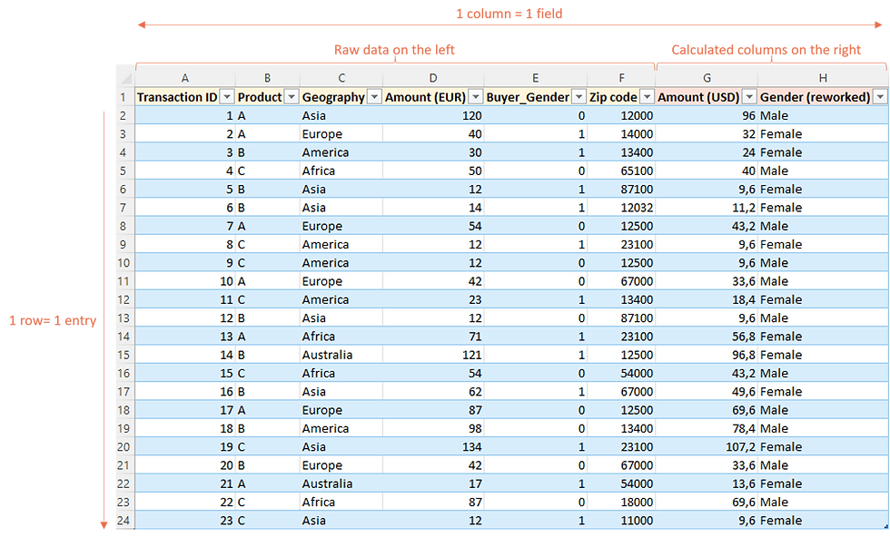
Each row represents a unique entry (for instance a sales transaction)
Each column contains a unique field which are attributes of these entries.
To give some examples:
✅Transaction amount, age of the customer, or gender of the customer are all distinct fields.
❌But the sales amount in May and the sales amount in June are NOT distinct fields! The "Sales amount" should be in one column, and the "Month" in another column.
When data is extracted from a corporate system, it usually is already structured as a database.
💡If the data is not structured properly, you can check Power-user's UnPivot feature to flatten tables, or watch this UnPivot video.
Format your database as an Excel Table
Select your database, go to the "Insert" tab and click "Table". Rename your Table as "MyData" for instance, from the "Design" tab.
Why should you use a Table? There are many reasons but here are 2 very important ones:
✅When you create PivotTables on this database, their data source will automatically adjust to any number of rows or columns you add in the future instead of having to manually update every PivotTable's data source for each new column or row you add later.
✅Tables automatically extend your formulas down to the last row. So when you want to update the dashboard, you won't have to do this manually. It will save you time and reduce a lot the risk of errors.
💡Want to learn more about Tables? See 12 reasons to use Excel Tables.
Alternatively, and only if you really, really hate tables, you could use a named range instead.
For this, go to the "Formula" tab and click "Define Name". In the "Name" field type "MyData" and in the "Refers to" field you can use a formula like this:
=OFFSET('Data Source'!A1,,,COUNTA('Data Source'!A:A),COUNTA('Data Source'!1:1)) This creates a range named "MyData" which you can reference in your PivotTables, and this way you won't have to update the data source of your PivotTables when rows or columns are added.

Other important good practices for a Data Source sheet
✅Data sources should contain both the raw data and the calculated columns, with a color scheme to differentiate them.
✅Don't touch the raw data (beyond formatting). This is what calculated columns will be for. If you make changes you will have to repeat them with every update, and we don't want that.
✅Data sources should have the unique ID in the first column. This will make it easier to use lookup formulas in your calculated columns.
✅Calculated columns should be all at the very right. This will make future updates of raw data easy.
Let's take an example.
In our extraction, there is a "Gender" field which contains 0 for males and 1 for females. We want to change this into actual "Male" and "Female" text because that's how it will be in the dashboard eventually.
To do this, we will add a new calculated column at the very right of the table, which will have the role of converting the numeric value into legible text.
❌Don't insert the calculated columns next to the "Gender" column in our raw data. It might be tempting, but it's REALLY NOT a good idea. This would make it very long, painful and risky to update your raw data with new extractions, having to paste columns one by one instead of all at once.
The Reference tables sheet
This sheet will host the referential for your data extracts.
Create actual tables for your data in the Reference tables
Just like for your data source, once you have added a referential in your "Reference tables" worksheet, select it and go to "Insert" then "Table". That way, the lookup formulas in the calculated columns of your Data source worksheet will automatically adjust if you add new elements to the referential.

Use lookup functions towards your reference tables to convert your raw data into calculated columns
It might be obvious, but it's much simpler to just change or add a value into a reference table than to update multiple formulas in your calculated columns. So if your raw data is in EUR and you need multiple calculated columns converting them to USD... referring to a reference table for currencies will allow you to just update the exchange rate rather than change all your formulas.
💡We recommend using the XLOOKUP Excel function instead of the old fashion VLOOKUP and INDEX/MATCH, as this new functions performs better on many aspect.
The PivotTables sheet
PivotTables sheets are where your data is organized and analyzed. They act as a necessary intermediary between your data sources and the data visualization charts.
Create PivotTables from the Table containing your data source
When creating PivotTables, make sure to use the Table name ("MyData" in this case) as data source, not the address itself (not something that looks like "Data Source!A1:G5000").
If you select the entire Table and insert a PivotTable, the Table name should already be used by default as source, so it's easy.
And if you've opted for a named range instead of a Table, type F3 to show the names in the spreadsheet and insert it in the reference dialog box.
This way, you won't have to change the data source if you add new columns in the future.

Prepare PivotTables for each chart you will have in the dashboard
PivotTables are the engine under the hood: the people who see your dashboard won't look at them, but they are the essential piece that will make the whole dashboard automated.
There are multiple reasons you want to use PivotTables and not organize the charts sources manually. But one of these reasons is that all PivotTables in the workbook can be updated in 1 click. That's how we will be able to refresh the dashboard instantly.
Make sure you keep a few blank rows between each PivotTables
Your PivotTables may take more space when you update them later and there are more dates or products to show. So to avoid getting error messages when a PivotTable doesn't have the space it needs to update, you will need some buffer rows and columns.
Also, we will be adding Slicers (as explained later) and Slicers will required additional rows for each PivotTable just like filters.
The Dashboard sheet
Now it's finally time for the fun part! Let's create the beautiful dashboard itself, which will be the only sheet people will be looking at.
Use PivotCharts only
The whole benefit of having created PivotTables in the previous section is that you can now create PivotCharts.
Go in your "PivotTables" worksheet, click on a PivotTable and then go to the "Analyze" tab and click "PivotChart".
PivotCharts have exactly the same behavior as the PivotTable they are related to. They will in particular automatically update. So when you update your dashboard next month, you won't have to extend the data source of every chart to take into account the new month, that will be done automatically and you won't have to adjust the chart ranges manually.

Format your chart as you would with any "classical" chart
By default, PivotCharts are created with buttons. Right click on them and click "Hide all field buttons on chart".

Then format your PivotChart as you want it to look, just like you would do with any other chart.
Some advice in terms of chart formatting:
✅Pick the right chart type: you don't have to use bar charts, pie charts and line charts all the time! Using different chart types will give you better ways to highligh key information. It will also make each KPI easier to remember and stand from the data crowd!
💡Check this infographics on how to pick the best chart type for your data
💡Unlock dozens of advanced chart types with the Power-user charts Library


✅Less is more: remove axis, legends, gridlines, label decimals, etc. when they don't serve a purpose. The less clutter you have, the easier it will be to read the information that matters.
✅Use consistent and meaningful colors: use your corporate colors instead of default colors. Try to stick to a few colors, and applying them meaningfully to create contrast when needed.
Save chart as templates to avoid formatting manually each time
Don't reinvent the wheel every time: save your charts as templates so you can reuse the same format later.
✅It will save you a lot of time
✅It will help you maintain consistency, improving the overall visual effect of your dashboard
👉To save a chart as a template, right-click it and choose "Save as Template".
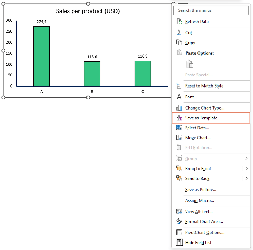
You will need to create a new template for each chart type (e.g. 1 for line charts, 1 for 100% column chart, etc.).
Then when you add a chart, you can just apply the template instead of redoing the entire format manually.
👉To reuse the template, go in the "Design" tab, click "Change chart type" and then "Templates" on the left.

Build the Excel dashboard!
Now you can just create as many charts as you need, format them using the saved templates and assemble them to create your dashboard step by step.
Make it visually appealing and self-explanatory!
💡Power-user has 2 useful features for you at this step:
Copy/paste chart dimensions in Excel is great to ensure your charts have the same size and that your dashboard doesn't look messy.
Swap chart positions allows you to easily arrange your charts on the sheet
Leverage Slicers and Timelines to simplify your dashboard
Slicers are just amazing. Slicers are basically like filters, but actually much easier to use.
An excellent dashboard is a dashboard that can be read and analyzed by different people in the organization, to avoid multiplying dashboard everywhere with partial data.
Ask yourself how the data could be analyzed in sub-segments:
C-Levels will want to look at aggregated data to see the overall key trends
Each product manager will probably want to see the sales on their own product
Each area manager will want to look at the data for their own geography
Etc.
Most people don't even know the existence of Slicers. So what they do is they replicate all the charts for each product, then replicate again all the charts for each geography, etc.
But if you have 10 products and 10 areas, that's 100 variation for each chart!
With Slicers, you can have just 1 chart and allow users to filter them based on what they want to look at and how deep they want to analyze. That way all of the information is available for everyone, in any combination they want, while keeping things simple.
👉To create Slicers, select a chart, go to the "Analyze" tab, and click "Slicer". Choose the related field, e.g. Product or Greography.
Now people you click on a value on the slicer, for instance Europe. the chart will instantly adjust to show only the values for Europe.

👉Link your Slicers to multiple charts. This way clicking just 1 Slicer will adjust the entire dashboard.
To do that, right-click on a Slicer and click "Report Connections". You will see all the charts you can link it to.

👉Timelines are exactly like Slicers, except they are better suited for Date fields. With a Timeline, you can filter data by day, month, quarter, year, or set up specific beginning and end dates. All your dashboard will then adjust to show only the data for that period. How cool is that?

In summary:
✅Slicers and timelins make your dashboard dynamic
✅Slicers allow you to deep dive on your data and look at it from different angles to really analyze and understand the key trends
✅Slicers keep your dashboard simple, with as few charts as possible
✅Slicers allow different profiles (C-Level, product owners, area managers etc.) to use the same dashboard and look at the same figures, each with their own eye
If you are familiar with VBA, create buttons activating Custom Views
For people familiar with VBA, you can give an extra boost to your dashboard by creating custom views.
This is interesting if you have many charts and you want to spare users the need to scroll up/down and left/right looking for specific charts.
👉First manually organize your charts in different views. A view will be the content of 1 screen and you will want to display on it a coherent group of charts.
👉Then for each view, create a macro with just just simple line of code:
Application.Goto Range("B1"), Truewhere B1 in this example is the cell you will want at the top left corner of your view (instead of B1, it's actually better if you name the cell and reference that name).
👉Now you can assign this macro to a shape (and why not even an icon?). When the user clicks this shape, it will take them to the custom view.
You can use this to create a kind of "menu" on the left, with shapes linking to different views. Freeze panes to make the menu always visible as people navigate to different views.
Updating the dashboard
Now let's see how long it takes to update the dashboard. What you just need to do:
✅Paste the new extract in place of the old one in the data source
✅Select a Chart, right-click and hit Refresh. All PivotTables and PivotCharts will update.
That's it. Your entire dashboard has been updated in less that a minute.
Presenting your Dashboard data with PowerPoint
Prepare your charts so they can easily be exported to PowerPoint
Very often, your dashboard will feed a PowerPoint reporting to be shared with management, sent to clients, etc.
You probably have experienced how copy / pasting charts into PowerPoint sometimes forces you to waste a lot of time resizing them again and again.
In PowerPoint, insert a rectangle shape just as big as your slide. Paste it in Excel. You can consider this shape as a preview of the PowerPoint slide. Placing charts inside this frame you will see how big they will look on the slide when you paste them there.
💡You can find more detailed explanations on this trick in this dedicated tutorial.

Link PowerPoint and Excel to automatically update the presentation
If you have a PowerPoint presentation that you need to update every time you refresh your dashboard, you should definitely consider pasting your charts from Excel to PowerPoint with links.
Copy a chart in Excel, go to PowerPoint, click Paste / Paste Special and select "Link" on the left of the window.

Now refreshing charts can be done from PowerPoint with a simple right-click.
However Microsoft links can break in a number of cases, typically when the files get renamed, moved to a different folder, or just if a different user works on them.
💡Check this extensive article about the various types of links between Excel and PowerPoint, highlighting the strentghs and weaknesses of each.
💡The Power-user link which was designed for robustness and resists all above the scenarios.


Want to be an Excel & PowerPoint ROCK STAR? Download the Power-user add-in: it contains templates, diagrams, charts, maps, icons and many tools that will make you a super hero with PowerPoint and Excel!


